Want to design an original and impactful marketing email? Not sure where to start? In this article, we’ve put together 11 email marketing examples to get your creative juices flowing!
Email marketing is an essential part of any effective digital marketing strategy. Because of this, designing your email newsletters may seem like a daunting task. Don’t worry, though, email design doesn’t have to be an uphill battle.
With solutions like Brevo, designing professional email marketing campaigns is easy to do. Our drag and drop editor allows you to create stunning email newsletters that convert. If email design isn’t your strong suit, Brevo offers dozens of free newsletter templates to make sure you get started on the right foot.
Don’t believe us? Take a look at these 11 email marketing examples. They’re all from real clients and were created on Brevo.
To get started, open your free account today and create stunning email newsletters like the examples below.
Brevo’s Best Email Marketing Examples
1. Bunny Williams Home

The first email marketing example we’d like to share comes from Bunny Williams Home. In particular, this email campaign does a great job of featuring a product, in this case the Bamboo Sofa.
The email starts with a large image featuring the sofa followed by some descriptive text laying out what subscribers can expect in the rest of the email. The next photo comes off as especially striking thanks to the vibrant blue color of the product. From there, you get a chance to see other available colors and finishes.
What makes this such an effective email is its narrow focus. This newsletter is part of Bunny Williams’ “Essentials” campaign, where they feature one product at a time. This is a great way to display your inventory over time and cast a spotlight on individual products.
From the elegant design to the clear call to action, this newsletter definitely stands out as an excellent email marketing example.
2. Jam with Jamie
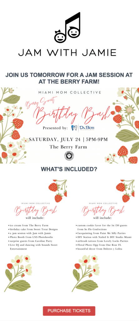
Next up, this event reminder from Jam with Jamie is another great email marketing example. Jam with Jamie is a children’s entertainment company, meaning their email subscribers are mostly parents and child care professionals.
With this in mind, it’s clear this marketing team knows its audience. This email is rather simple in design, yet effectively communicates both the most essential information as well as extra details about the event.
This two-pronged approach is good for both time-strapped subscribers who just want to know the where and when as well as uncertain readers who want more information before deciding whether to buy tickets or not.
Speaking of tickets, Jam with Jamie does a nice job of incorporating a clear CTA button in this email. It’s easily visible, matches the color palette of the rest of the email, and explains where it’s taking you. Most importantly, there’s only one CTA button.
An event reminder email is likely not the place to feature new products or announce discounts. Doing so may distract your readers and won’t help ticket sales or event attendance. For this type of email, having just one CTA button is a good idea.
3. Self Care Society
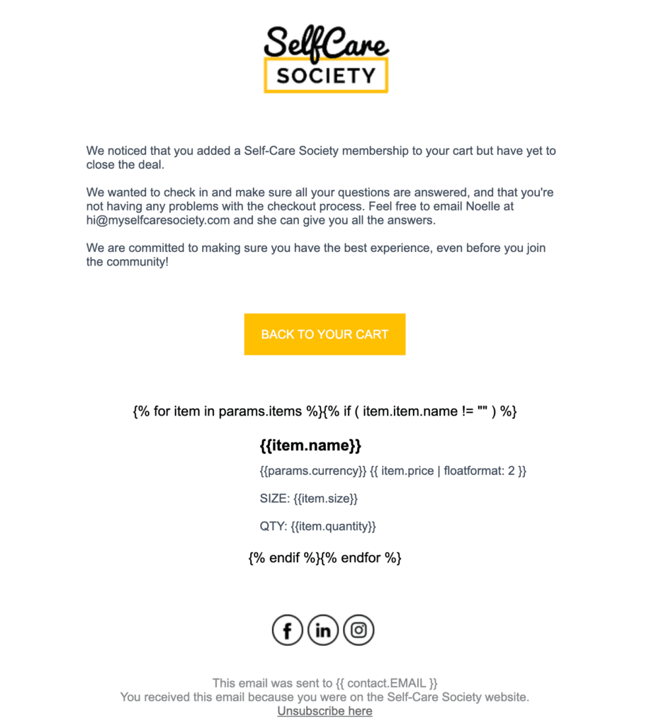
Our next email marketing example is an automated abandoned cart notification created by Self Care Society. When one of their users adds a subscription plan to their cart but doesn’t complete check-out, they get a follow-up like this.
See that funny looking code under the CTA button? When an email like this lands in a customer’s inbox, the product they left in their cart appears there. Adding this kind of personalized, dynamic content is easy with Brevo, check out the full guide here.
The best part? These types of email can be easily automated using a workflow. Instead of manually following up with clients, your email marketing service should be able to do the work for you.
Because this is a reminder email, its design is simple and direct. The point here isn’t to promote a new campaign or feature a product or service. Instead, reminders like this should be helpful, straightforward, and not too lengthy.
The only links point to the Self Care Society’s helpline and the client’s cart. That’s the way it should be! Don’t use a reminder email like this as an opportunity to include highly promotional content.
When sending abandoned cart notifications, your email should be targeted, personalized, and focused. For inspiration, take a look at this article on abandoned cart email examples.
4. Three Sheep and a Mill

Three Sheep and a Mill is a textile company that does a great job with their email marketing campaigns. In this example, they feature a selection of products, complete with high-quality images and informative descriptions.
This campaign shows what it means to really know your audience. The email content consists mostly of images. This gives subscribers a chance to get a look at the textiles up-close. What little text there is mostly consists of very specific product descriptions like function, materials, and cleaning instructions.
For potential customers, this email copy gives them everything they need without coming across as overbearing. Striking the right balance of informative yet not overly-detailed can be tricky to do, but that’s what makes this a top-notch email marketing example.
5. Permission
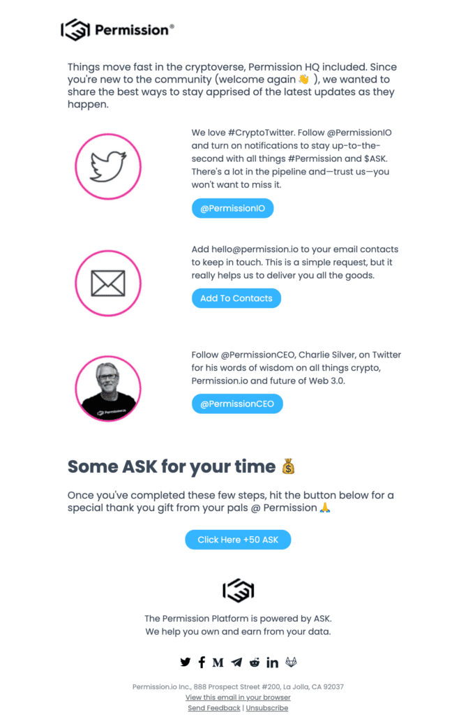
Spinning off a traditional welcome email, this email marketing example by Permission has a lot to offer. Welcome emails are a great way to immediately connect with your new subscribers, but they can sometimes get swept away with double opt-in confirmations.
For this reason, it can be a good idea to reconnect with new subscribers several days after they’ve signed up and offer something different than your initial welcome email. This is exactly what Permission did.
This second-round welcome email not only says welcome once again. It also links to their social media and tells their audience how to stay informed via email. Even better, they offer a reward for email subscribers who get fully connected.
This type of email has many benefits. First, you create a natural touch-point early on in a new customer relationship. Second, you bolster your brand’s reach by linking to social media.
Third, and perhaps most importantly, asking subscribers to add you to their email contacts can do wonders for your deliverability rate.
In sum, this welcome email example is worth taking notes on. Well done, Permission!
6. Qapitol
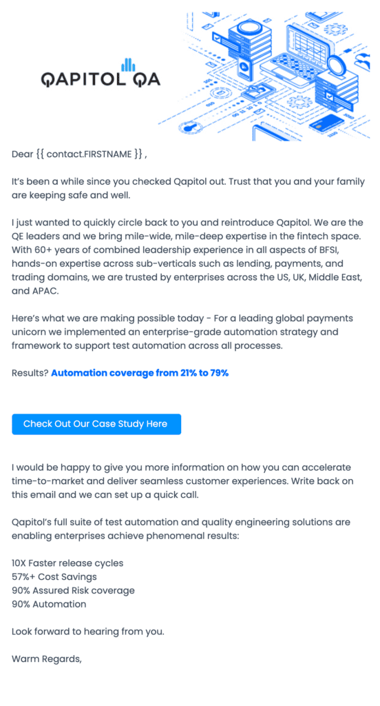
Qapitol, a SaaS company, gives us another classic email marketing example. Specifically, a re-engagement email. This campaign targets users of their platform who haven’t been active in a while.
The email starts with a friendly tone, speaking to contacts like you would in a personal note. Then, they go on to re-introduce Qapitol and remind the contact what their business can do for them. The tone here is not overly pushy, yet concise — well done Qapitol!
Another thing that makes this a great re-engagement campaign is that the CTA button links to a case study on the benefits of using their software. Providing email list subscribers with valuable content like this is a great way to win them over and continue to convert.
Finally, this campaign has another CTA at the end. By inviting contacts to reach out and start a conversation with their business, Qapitol makes their subscribers feel heard and valued. As well, instead of putting this CTA in a flashy button, incorporating it into the body of the email helps it come across as a sincere invitation.
All in all, this is a really good email, checking all the boxes for re-engaging your contacts.
7. Elum Designs

Elum Designs’ October 2021 newsletter is eye-catching, on-trend, and just an all-around great email. It’s full of catchy subheadings, nails the fall imagery, and showcases their products all in one!
By debuting their January 2022 releases in October 2021, Elum is generating quite a lot of buzz with this campaign. Consumers love new releases. For this reason, this type of content is great for boosting your click through rate.
Speaking of, take a look at the CTA buttons in this email. They’re strategically placed and allow subscribers to navigate to find the products they’re looking for. They also do a nice job of sectioning up the newsletter.
You may be thinking, “There’s no way I can make an email marketing campaign like this! Elum Designs is a design company…”
You’re right about the second point, but Brevo’s email templates may make you reconsider the first one. Choose from dozens of newsletter templates, with plenty of holiday/seasonal options available too!
8. Workona

For an example of how to provide value to your newsletter subscribers, take a look at this email from Workona, an online workspace solution.
New users get a series of onboarding emails with tips and tricks to learn how to best use the platform. On Workona’s side of things, these are automated emails. But they’re much more than that! They are an essential part of the lead nurturing process and can help build lasting customer relationships.
Though it may not seem like it, emails like this are very important to your overall email marketing strategy. If the only thing your subscribers get from you is hyped-up content marketing, your open rate and click through rate may begin to suffer.
For SaaS businesses, other ways to provide value in your email campaigns include linking to case studies, offering content like ebooks or webinars, and giving free trials of paid features.
You can expect to reap the benefits of this kind of marketing communication in the long-run, as your subscribers will come to see the value of your newsletters.
Looking at the email design, this campaign perfectly embodies Workona’s brand image. Their color palette, font, and graphics make this content them. You can easily do the same with your own email marketing communications by uploading your brand kit to Brevo.
9. Pink Dolphin Clothing
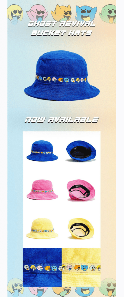
This email marketing example from Pink Dolphin Clothing is a good demonstration of how to make your newsletter stand out without a lot of text. The written content of this email says no more than the product name and “now available.” There’s not even any pricing info. But the campaign does a really good job of grabbing your attention.
Take a look at the background header and footer of this email campaign. It’s the same design as on the bucket hat! By taking a design element from the product itself and integrating it into the newsletter design, Pink Dolphin goes the extra mail in terms of creating unique email content.
Another noteworthy aspect of this campaign is that it doesn’t try too hard. Without much text and no visible CTA buttons, this promotional email relies on subscribers’ curiosity to get them to click through.
Now, this type of email design won’t work for all brands. Pink Dolphin’s trendy, ecommerce market may not be the same as yours. That said, this example can teach us a lot about designing out-of-the-box email marketing campaigns. For your brand, it may be adding a gif, trying out some new fonts, or pulling a joke!
10. Sjaak’s Organic Chocolates

Another excellent email marketing example, Sjaak’s Organic Chocolates’ campaign has a few things going for it. First, you’ll notice the newsletter uses the inverted pyramid structure. This technique is a great way to organize your email content.
You should place the most important and attention-grabbing information first. In this case, Sjaak’s highlights their Halloween pumpkin carving content. From there, the email continues with additional details and other featured products.
Even the images can be part of the inverted pyramid structure. See how the smaller ones come later on in the email?
Your audience’s attention span for marketing emails is incredibly short. That’s why using this structure for your content can be so helpful.
Another great aspect of Sjaak’s email newsletter is all of the linking to social media. They’re not just including CTAs to their Instagram. They’re including their account name and a hashtag specifically created for this contest. Creating campaigns that interconnect your various marketing channels is a great way to expand your reach.
Campaigns like this are great for building up social proof, too. When potential customers see people on social media enjoying your product, they become interested as well. Further, it helps your subscribers, especially new subscribers, trust your business.
One last thing to point out about this campaign: the unsubscribe button. Though you may not want to see them go, people on your email list must have some way to unsubscribe. This is a best practice of email marketing and will even help with deliverability.
11. Saints and Sinners
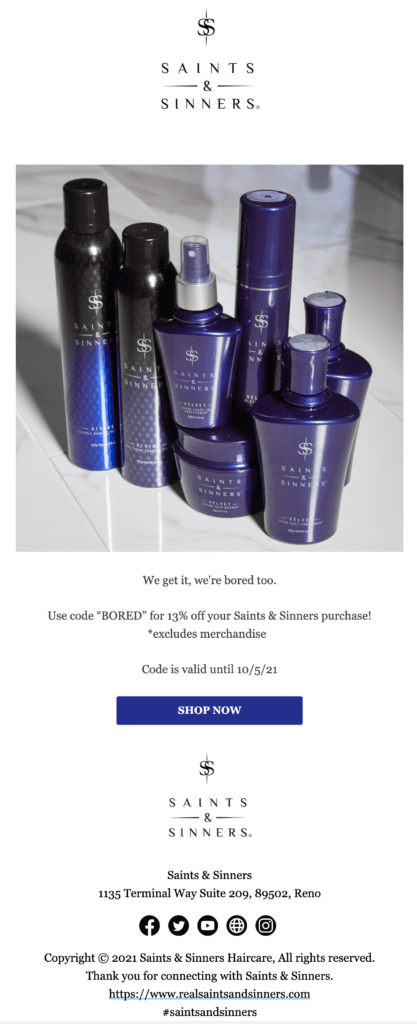
Our next email marketing example comes from Saints and Sinners. This campaign perfectly demonstrates how important email subject lines are.
This campaign went out in early October 2021 when Instagram, WhatsApp, and Facebook experienced an hours-long outage. Whereas many of us in digital marketing may have been at a loss for what to do in such an unexpected situation, Saints and Sinners had a great idea and moved quick.
They sent this email campaign with the following subject line: “Instagram may be out but our website isn’t! Hint: there’s a discount!”
Not only does this subject line catch readers’ attention because it is so timely and relevant to its clientele, but it also promotes a flash sale.
In terms of email marketing strategy, this campaign hits the nail on the head with timely and targeted content. Just after Instagram went down, subscribers got an email proposing another platform to scroll through. And with a discount to boot!
11 Email Marketing Examples Later…
…we hope you’ve gotten a better understanding of what makes an email newsletter pop! As we said before, email design and content marketing like this doesn’t have to be technically difficult.
With solutions like Sendiblue, anyone can create stunning and successful email marketing campaigns that convert. Our free plan comes equipped with features like automation and contact list segmentation, which cut down on your busy work and deliver personalized emails to your audience!
It doesn’t end there, though! Brevo is multi-channel marketing software. Handle transactional emails, build landing pages, and manage your CRM all in the same place.


